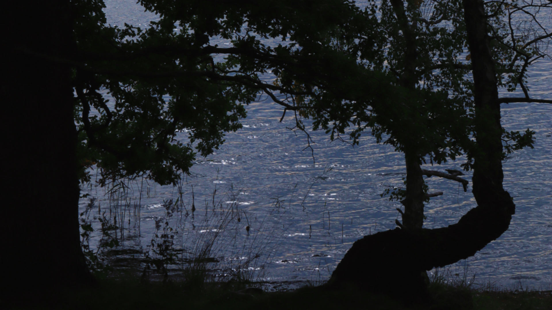
The second peer review is about discussing website design, and I’m glad to be assigned to Ronny’s website, https://ronnyrants.com/ . As a photographer, Ronny has done an excellent job showcasing his aesthetic style on the website. Upon entering the site, the homepage features a full-screen photograph of a snowy mountain landscape, which I believe to be one of Ronny’s works. This is highly persuasive for the core theme of the website, “a blog for photography enthusiasts who want to learn how to improve their craft.” It straightforwardly establishes credibility through excellent work, validating the content of the website. Another aspect I appreciate about the choice of background image for the homepage is that I can immediately see the color palette of the image aligning with the main colors of the website. The grayscale, black, blue, white, brown… These colors blend perfectly together. My first impression is one of professionalism, cool tones, simplicity, yet depth, imparting a sense of stability. Coupled with the title “Pixel Perfect,” yes, I believe I can learn the professional knowledge about photography and cameras that I desire on this website. The overall first impression a website gives is the charm of its design and composition. What is the focus of the content, who is the author, through design, all these can be perfectly expressed. Ronny has been very successful in this regard.
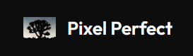
Noteworthy is the icon on Ronny’s website, a backlit black tree. At the top of the website, the navigation section is embedded in a black bar on the right, with the website’s title and logo on the left. I really like this design. The text is white, the logo’s background is light, but the main tree is black.Two contrasting colors intertwined with each other, creating a visually pleasing balance. Therefore, I believe Ronny’s choice of logo was carefully considered and fits perfectly with the overall website style.
At the bottom of the homepage, there is a guiding arrow indicating the sequence for visitors to browse. Scrolling down reveals three images summarizing posts: Gear, Guides, and Stories. Each is accompanied by a relevant image. One area for improvement, in my opinion, is to consider making these three titles clickable links for content navigation. Because Ronny has added interactive effects to the images, which makes me eager to click on them. Unfortunately, clicking does not lead to more interactivity. If it could directly link to related post content, I believe it would be a very good form of content guidance. For example, when I click on “Stories,” it could directly link to posts tagged with “Stories.” This would facilitate users in selecting the content they want to read and improve efficiency.
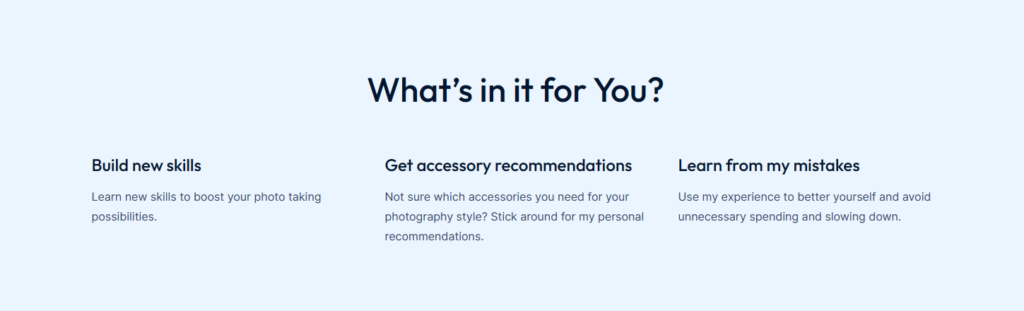
At the end of the homepage, Ronny also presents the “About me” section, allowing users to quickly understand most of the important content when first entering the website. I think this is a clever design that doesn’t feel cluttered or disjointed. After clicking on the “About me” page, there is a section at the bottom titled “What’s in it for you?” which summarizes the information users will gain from the website. I think placing this section on the homepage would be a better choice. Because it’s part of the introduction and can help users better understand the website’s content sooner.
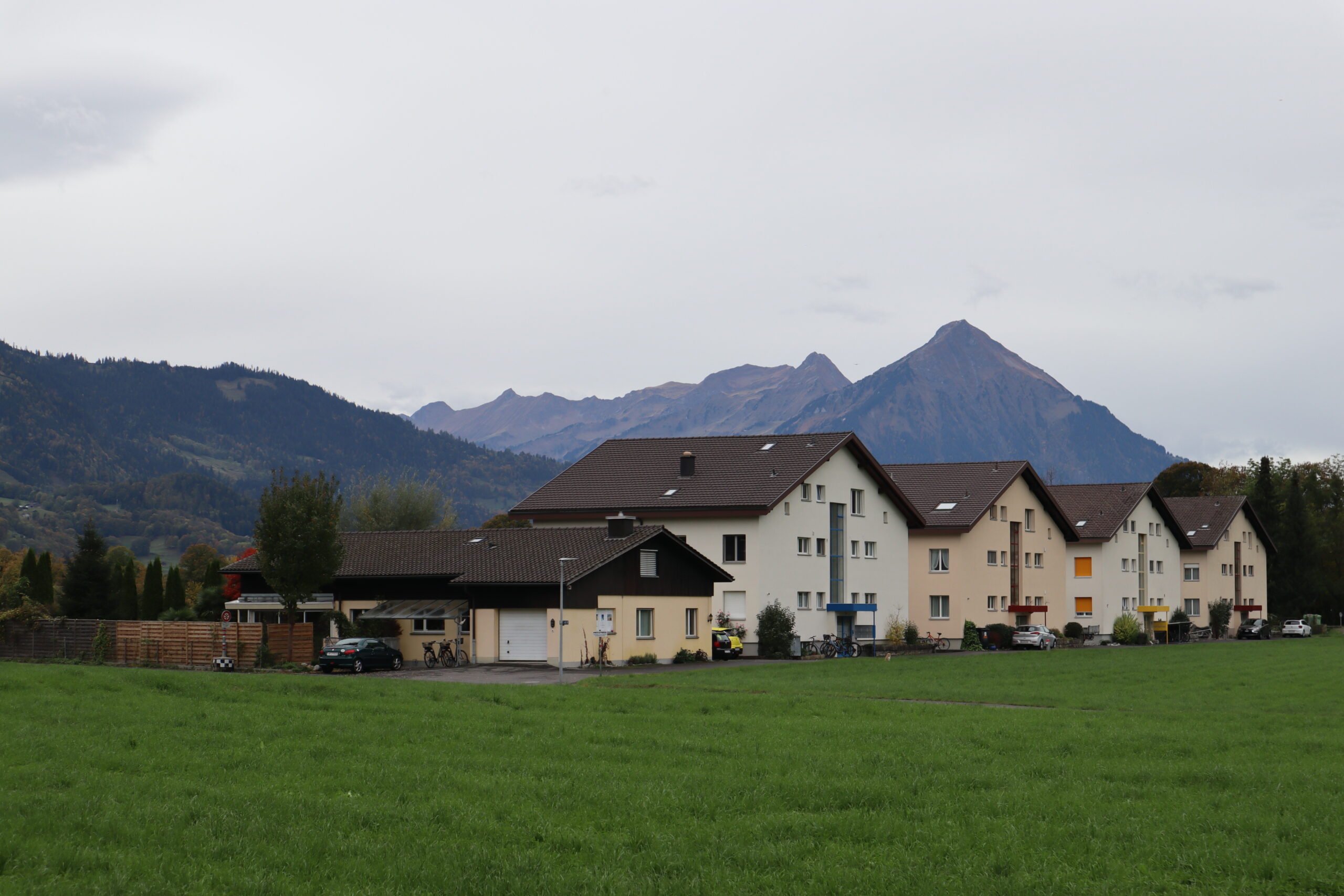
Each category page on Ronny’s website is accompanied by high-definition photos as covers and a brief description explaining the page’s content. It would be a great idea to create a page specifically showcasing excellent works would be beneficial. This would allow users to better understand the application of related knowledge from these works. Different tags, such as “the rule of thirds” or “blue hour,” could be added below the photos. Through these tags, users could directly navigate to related content posts to gain more detailed knowledge. Learning through examples and tags, is more effective and provides more accessibility to the website.
Overall, Ronny’s Pixel Perfect website has excellent consistency and aligns well with the theme in terms of color tones and style. If more excellent works could be showcased, it could become a very practical and personalized photography knowledge website.